Tuesday, 11 May 2010

AS Coursework - Evaluation

After Completing my final product I evaluated my work and progress.

In what way does your media product use, develop or challenge forms and conventions of real media products?
By researching into different music magazines it has helped me to develop the forms and conventions of a real music magazine. I noticed that magazines titles were the biggest font used on the front cover. This made it stand out. I used this information and applied it to my magazine by making the title of my magazine on the front cover the biggest text used on the page. The front page is also dominated by a picture of the main feature of he magazine.I also used a barcode on my front page which I placed on the bottom right as I found that most magazines displayed there barcode here as it is easy to scan.On my contents page I also made sure that the title of the page was the biggest font used.I also found in my research that many magazines write a letter from the editor. I thought that this was a good idea so I wrote a short paragraph about the magazine and what was featured inside it.I also found from my research that magazine contents normally have regular articles that are featured each issue and features that are only featured once such as interviews with artists and bands. I used this form and convention and also used regulars and features in my contents page to make it as professional and real as possible. On my double page spread I used the convention of columns that many music magazines used.

How does your media product represent particular social groups?
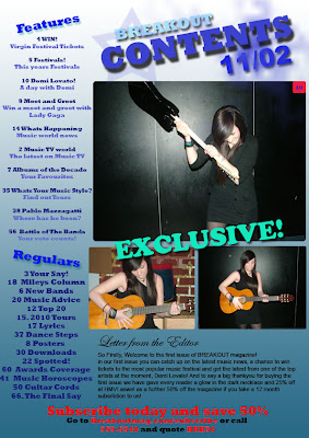
My magazine represents a young age group. I have used a picture of a teenage girl holding a guitar which shows that this magazine is a music magazine. On my double page spread I have used a picture of the artist with a big cheesy smile. This shows that she is enjoying what she is doing and enjoys the music because she is holding a guitar.On the contents page I have used a picture of the main featured artist with an electric guitar looking as if she was about to hit it on the floor. This shows that she also has a reckless side to her and has fun while making music.

What kind of media institution might distribute your media product and why?
Before starting my main task I researched into different media institutes that distribute magazines. I found that Bauer consumer media distributed two very well known and popular music magazines, Q and Kerrang! The music magazines that Bauer Media do distribute I found are mainly aimed at older teenagers and young adults. I think that my magazine could fit into this group and a company like Bauer Media could distribute my final magazine.

Who would be the audience for your product?
When starting the task I researched different types of music and school magazines. I found that a lot of music magazines are aimed at teenagers and young adults. From this research I decided to target my music magazine at young teenagers, both boys and girls. I thought that this would be the best audience to market my magazine at as this age group regularly buy magazines either weekly or monthly.

How did you address/ attract your audience?
by researching different music magazines I found information about what I should include in the music magazine and what would look good. I found that it would be a good idea to add information about latest bands and popular music. I found that these two features were included on most music magazines. I also included interviews with music bands and artists. This was also shown in most music magazines. My double page spread was an interview with a new artist as I found that most music magazines used their double page spread as an interview for artists. I used the research from other music magazines wisely and made sure that I included important features that I found on the magazines.

Which technologies have you used?
To complete my final product I have used a range of software that I was not used to.
To complete the front covers and contents page of my music magazine I used Adobe Photoshop CS2. This is a programme where I could put different layers and photos on top of each other to create good looking effects that made my product look more professional.
To create my double page spread I used Adobe InDesign CS3. This allowed me to add guidelines and add big chunks of text that I had already written out in Microsoft Word. This saved a lot of time. By putting in guidelines where I wanted to put my text made it easier to line up the text and make it more professional looking.I was already familiar with photo editing software as I have used it before to edit and Photoshop pictures and photographs. I found it easy to add pictures, move them about and also scale them down without making the picture out of proportion. I was also familiar with the layering so this was not a problem. I found it hard to add text and move it about. I had problems trying to change the size of the text so that it did not pixelate. I also found it hard to add effects to the text. I used online tutorials to help me so that I could edit the text and make it look as professional as possible. I found it hard to use Adobe InDesign as I was not used to this programme. Again I was familiar with the layering of the product but I found it hard to add photos and scale them down in proportion. Again I used online tutorials to help me understand how to do this. I have learnt new photo editing skills while completing this product. I am now able to edit photos such as giving a photograph a Polaroid effect. I am also able to customise and edit text as well as adding effects such as making a drop shadow behind the text.


Looking back at your preliminary task, what do you feel you have learnt in the progression from it to the full product?
I have learnt a wide range of new skills since completing my preliminary task. I learnt a lot of text effects and how I can use Photoshop to edit photos and fonts. I also learnt about professional layouts about how to layout front pages, contents and double page spreads. I also learnt about the features of a magazine and how to target these at an audience. I also learnt how to cut out pictures on Photoshop and how it was best to fill pages and not leave blank spaces.

Monday, 10 May 2010

AS Coursework - Production

After researching into similar products and planning my music magazine I then started the production of it.

I used my templates to help me decide where to put things and how I was going to lay out the magazine. I used Adobe Paint Shop CS2 to create my front cover and contents page of my magazine. I used Adobe InDesign CS3 to create my double page spread.

I plan to use blue white and yellow colors through-out the magazine as this keeps the magazine aimed a both boys and girls. These colors also go together quite well so will not clash or look messy.

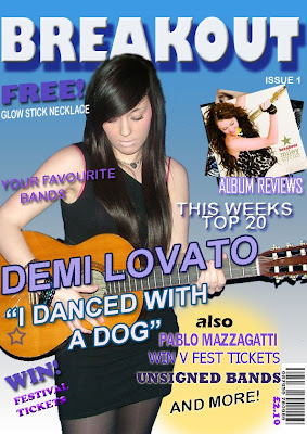
The first part of the production was the front cover. Before I started I took pictures of my friend posing as a new artist. I had previously decided in my planning stage that the front cover would be dominated by a picture of the main feature of the magazine as i had found this was a typical convention of most magazines.

I took a few photos so that I could go through them to choose my favourite and one that would look good on the front cover. I decided that the artist was to hold a guitar as this was a typical convention of many music magazines. It shows that the magazine is about music and targets the specific audience to buy it.


After I had took these pictures I chose the best ones that I thought would look good in the magazine and would attract people to buy it. I then started designing my magazine on Adobe Photoshop and Adobe InDesign.


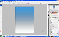
The first part of production was designing my front cover. The first thing i did was add a gradient background. i chose blue and white to keep with my colour scheme and to keep the magazine targeted at both girls and boys. I did this by making a layer and filling it with the gradient tool. I played around with the angel of which i wanted the gradient at. I finally blue at the top and gradually going into white at the bottom as I wanted my title a light colour and this wouldn't have stood out against a white background at the top.

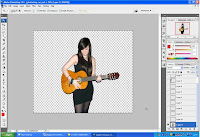
I opened my chosen picture on Photoshop so that i could cut it out and put it on my magazine. Firstly I edited the picture and resized it to fit on my magazine front page. I used a tool called magic wand that allowed me to cut out pieces from the background that I did not want in the picture.


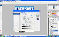
After adding all pictures onto my front cover I added text. to add effects to text I double clicked on the text layer and selected effects that i wanted to use. This example shows the effects i used to create the title of my magazine. I used a drop shadow to give the effect of the text casting a shadow and bevel and emboss. Other effects that i used included inner glow and colour overlay.


On my front cover i also found that i needed a barcode to make the magazine more authentic. i wanted to place this in the bottom right corner of the page as i found most magazines did this and didn't find any that had barcodes on the left. instead of copying a barcode from another magazine i used Photosho to create my own.


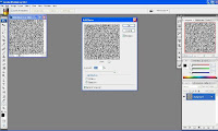
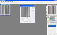
I used an online tutorial to help me create my barcode. To create a barcode I went into filter and selected noise then add noise, i then changed the amount to 400% and added gaussian and monocromatic.


When I had done that i went into filter, motion blur and changed the angle to 90 degrees and changed the distance to 999.


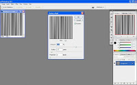
I then went into filter, unsharpen mask and played around with the settings until the image looked as much like a barcode as possible. I then saved it and added onto my magazine before cropping it and adding into the bottom right.
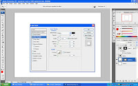
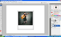
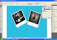
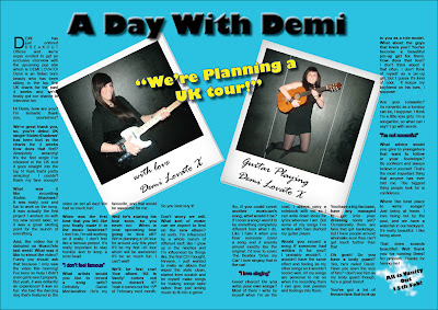
Another photo effect I used was on my double page spread by making a photo look like a Polaroid. Again I used an online tutorial to help me create the effect.


Firstly I made a rectangular shape using the shape tool. I then used layer style to edit the rectangle and make it look more 3D and authentic. I used a drop shadow, inner glow and colour overlay to get the effect.


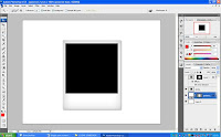
I then added a black square onto the back rectangle where is was going to add my picture.


Finally I added my chosen photo to the black square. this gave me my Polaroid effect.


I was then able to place both edited photos onto my double page spread using InDesign. i went to file, place and was able to select the image that I wanted from my files. i used the rotate option to put the photos on a slight angle to give the effect that they have been thrown onto the page.


This is my final product.


AS Coursework - Planning

After completing my research into school and music magazines I started planning templates for my music magazine. I used ideas from my research to design a suitable template that i thought would look good if I made it into a real magazine. I used publisher to create the templates.

Front Cover Template
This is the template of my front cover. I have made the title of the magazine big so that it stands out. I plan to make the size of this text the biggest that is used on the page so that it stands out and readers can see that this is the title of the magazine. I also plan to add a picture of a band or an artist into the middle of the page. This will dominate the page and will be the only picture on the front cover. I think this will be a good idea as it will stand out and show the potential readers who the main feature of the magazine is. This will also give the readers an idea of who the targeted audience is.


Double Page Spread
This is a template of the double page spread. I plan to use a big title which will be the biggest font size on the page. I plan to do an interview with the featured artist that is on the front cover of the magazine. I the middle of my double page spread i plan to have two pictures of the artist in Polaroid picture effect so that it looks like the photos are taken from a photo shoot. I will also use text in the middle of the page spread quoting a part of the interview that may draw potential readers into buying the magazine to read it.


Contents page
My contents page will be dominated by a big picture and title. I plan to use a big picture of the main feature of the magazine so that it draws in readers and buyers. I want to add a big title with the name of the magazine and contents with the issue date of the magazine. I plan to add the contents of the magazine down the left side of the page and also a few in the bottom right. i will also add a letter from the editor as i found that most magazines do this in my research. this will be a short paragraph explaining things about the new magazine and what to expect from it.


After I had designed the templates I created an interview to put on my double page spread. From my research I found that many music magazines used double page spreads to interview new and upcoming bands. I thought this was a good idea so I created an interview for a new band that I will put on my double page spread.


Now that I have done my planning I am now ready to start the production of my magazine.

AS Coursework - Research

Before starting the production of my final magazine I carried out more research into similar products. I researched into music magazine layouts and analysed these to show how magazines are designed to target specific audiences.

I found several different music magazine types. I researched on the Internet into Three front pages, Two content pages and two double page spreads from several different music magazines.

Front Covers
From research I found two front covers of music magazines. I analysed these to get more of an understanding of how the magazine is laid out and why certain features are used. I found that most front covers are dominated by a picture of the main feature in the magazine. I also found that the title of the magazine is the biggest text used on the page. this makes it stand out.


Contents Pages
These contents pages are from music Magazines, Word and NME. Again like the front covers the page is dominated by a photo of the main feature of the magazine and the title of the page is the biggest text used on the page. I will use this information when creating my own music magazine.


Double Page Spreads
These double page spreads are also from different music magazines. Again, like the front cover and contents page the page is dominated by the main feature. I also noticed that these double pages are usually used for interviews with various bands and artists. From this information I have decided that my double page spread will also be used for an interview with a music artist.