AS Coursework - Production
After researching into similar products and planning my music magazine I then started the production of it.
I used my templates to help me decide where to put things and how I was going to lay out the magazine. I used Adobe Paint Shop CS2 to create my front cover and contents page of my magazine. I used Adobe InDesign CS3 to create my double page spread.
I plan to use blue white and yellow colors through-out the magazine as this keeps the magazine aimed a both boys and girls. These colors also go together quite well so will not clash or look messy.
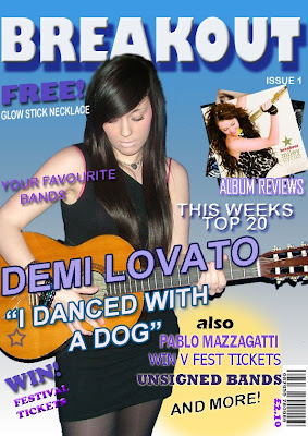
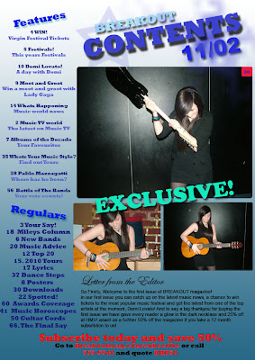
The first part of the production was the front cover. Before I started I took pictures of my friend posing as a new artist. I had previously decided in my planning stage that the front cover would be dominated by a picture of the main feature of the magazine as i had found this was a typical convention of most magazines.
I took a few photos so that I could go through them to choose my favourite and one that would look good on the front cover. I decided that the artist was to hold a guitar as this was a typical convention of many music magazines. It shows that the magazine is about music and targets the specific audience to buy it.


After I had took these pictures I chose the best ones that I thought would look good in the magazine and would attract people to buy it. I then started designing my magazine on Adobe Photoshop and Adobe InDesign.
 The first part of production was designing my front cover. The first thing i did was add a gradient background. i chose blue and white to keep with my colour scheme and to keep the magazine targeted at both girls and boys. I did this by making a layer and filling it with the gradient tool. I played around with the angel of which i wanted the gradient at. I finally blue at the top and gradually going into white at the bottom as I wanted my title a light colour and this wouldn't have stood out against a white background at the top.
 I opened my chosen picture on Photoshop so that i could cut it out and put it on my magazine. Firstly I edited the picture and resized it to fit on my magazine front page. I used a tool called magic wand that allowed me to cut out pieces from the background that I did not want in the picture.
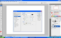
 After adding all pictures onto my front cover I added text. to add effects to text I double clicked on the text layer and selected effects that i wanted to use. This example shows the effects i used to create the title of my magazine. I used a drop shadow to give the effect of the text casting a shadow and bevel and emboss. Other effects that i used included inner glow and colour overlay.
On my front cover i also found that i needed a barcode to make the magazine more authentic. i wanted to place this in the bottom right corner of the page as i found most magazines did this and didn't find any that had barcodes on the left. instead of copying a barcode from another magazine i used Photosho to create my own.
 I used an online tutorial to help me create my barcode. To create a barcode I went into filter and selected noise then add noise, i then changed the amount to 400% and added gaussian and monocromatic.
When I had done that i went into filter, motion blur and changed the angle to 90 degrees and changed the distance to 999.
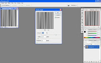 I then went into filter, unsharpen mask and played around with the settings until the image looked as much like a barcode as possible. I then saved it and added onto my magazine before cropping it and adding into the bottom right.
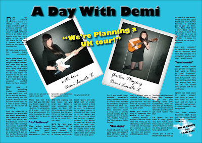
Another photo effect I used was on my double page spread by making a photo look like a Polaroid. Again I used an online tutorial to help me create the effect.
Firstly I made a rectangular shape using the shape tool. I then used layer style to edit the rectangle and make it look more 3D and authentic. I used a drop shadow, inner glow and colour overlay to get the effect.
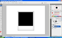
I then added a black square onto the back rectangle where is was going to add my picture.

Finally I added my chosen photo to the black square. this gave me my Polaroid effect.
 I was then able to place both edited photos onto my double page spread using InDesign. i went to file, place and was able to select the image that I wanted from my files. i used the rotate option to put the photos on a slight angle to give the effect that they have been thrown onto the page.
This is my final product.
posted by kelly___x at
06:09
![]()


0 Comments:
Post a Comment
Subscribe to Post Comments [Atom]
<< Home